Brand Campaign / Strategy
Preface / Introduction
Luxury Brand Campaigning
High fashion luxury brands typically launch their campaigns seasonally, i.e., Spring/Summer, Fall/Winter because a large number of them are clothing brands.
Taking a closer look, these seasonal campaigns are either pieces of a larger overarching yearly campaign, or an evolution / continuation of a story from the previous season that loosely ties them together. Here are two examples from 2017.
A long standing message from Hermès is that they breath other-worldly life into their products.
- Spring/Summer: Objects of Life"Features lifestyle photography of Hermès bags, jewelry, shoes and coats springing out of control from their model's hands, necks and feet with a life of their own."
- Fall/Winter: Objects Come Alive"Features product photography in a playful surrealist world where the Hermès jewelry, hats, scarves and ties now finally free, play together carefree on their own accord."
Gucci's over-the-top high fashion storytelling is what Gucci does best. Is it overindulgent satire? The overarching theme seems to be: people meet some kind of untamable wild.
- Spring/Summer: Wild Days and Nights in Roma "People meet big cats in the streets of Rome."
- Annual Cruise Campaign: A portrait of Chatsworth "People meet stereotypical British farm animals and lounge on leather Victorian furniture in the UK."
- Fall/Winter: Gucci and Beyond "People meet green people and monsters in outer-space."
Strategy Explained
Maclaren Brand Campaigns
Maclaren is not a high fashion brand. However, Maclaren has consistently benchmarked luxury brands over past decade, and delivers luxury inspired products to market with its ever evolving Objects of Design / Capsule Collection. This is one of the reasons the Maclaren brand stands out in a value-brand centric childcare product industry.
Maclaren launches an overarching brand campaign every two-to-three years. Each of those years carry an independent brand message that gives the overarching campaign a new twist or a stage of evolution each year.
- Heritage RemixedA visual system that entailed re-mixing english landscape paintings within specified grids, and using their elements in a whimsical, unexpected way.
- Flights of FancyLifestyle set photography with an whimsical, impractical / unreal stroll and activity theme.
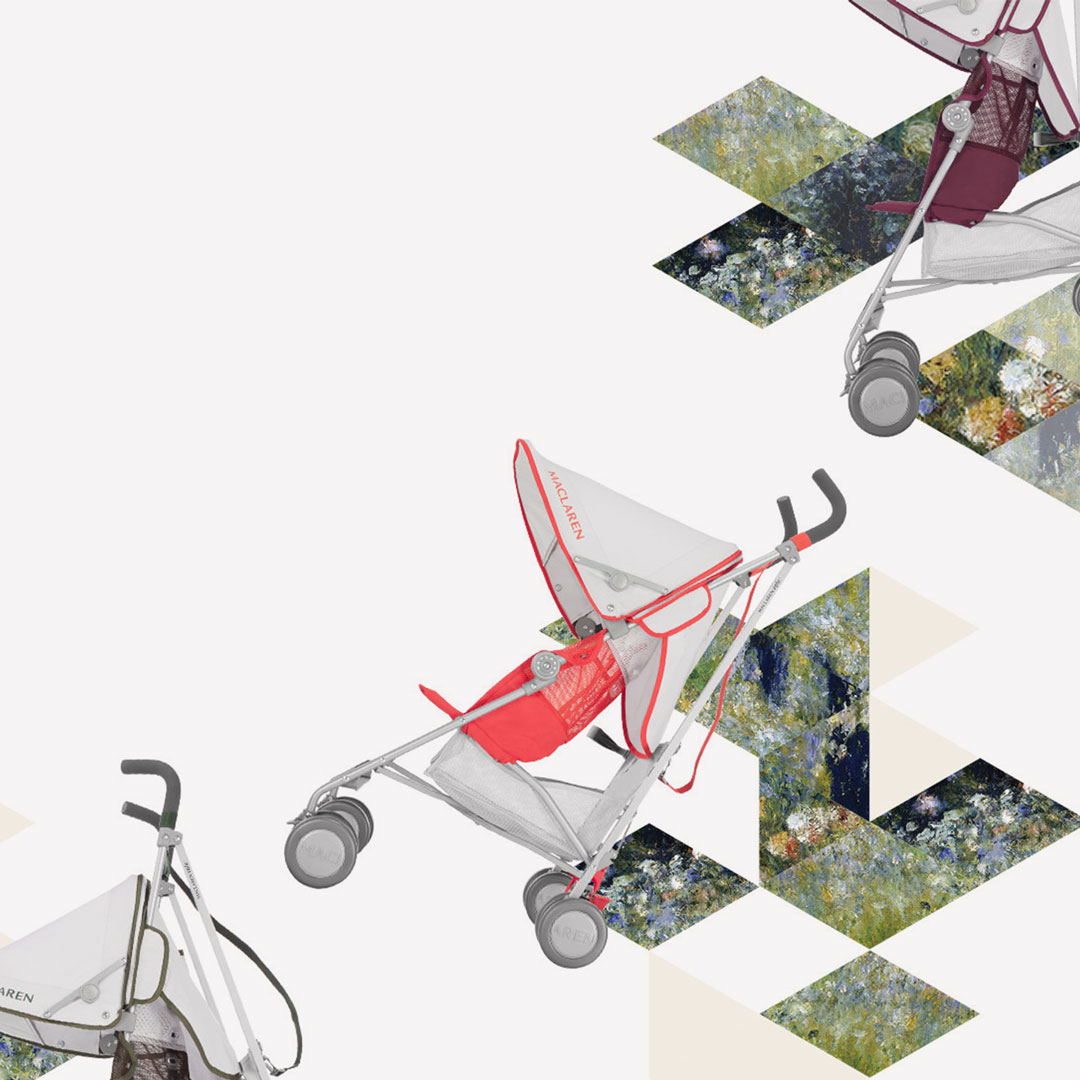
- Painting with LightProduct photography focusing on the bright colors of the newly developed Maclaren Core 3.0 line.
- 50 years of MaclarenA mostly marketing product / In-store campaign celebrating Maclaren's 50th anniversary.
- Travels to my ElephantMaclaren sponsering a custom Rickshaw in the annual Travels to My Elephant rickshaw rally held in India to raise awareness for Asian Elephants.
- Maclaren Ella_phantA social media competition for UK children to design an elephant statue to be auctioned at Sotheby's NYC.
Overarching Brand Campaign
Heritage Remixed
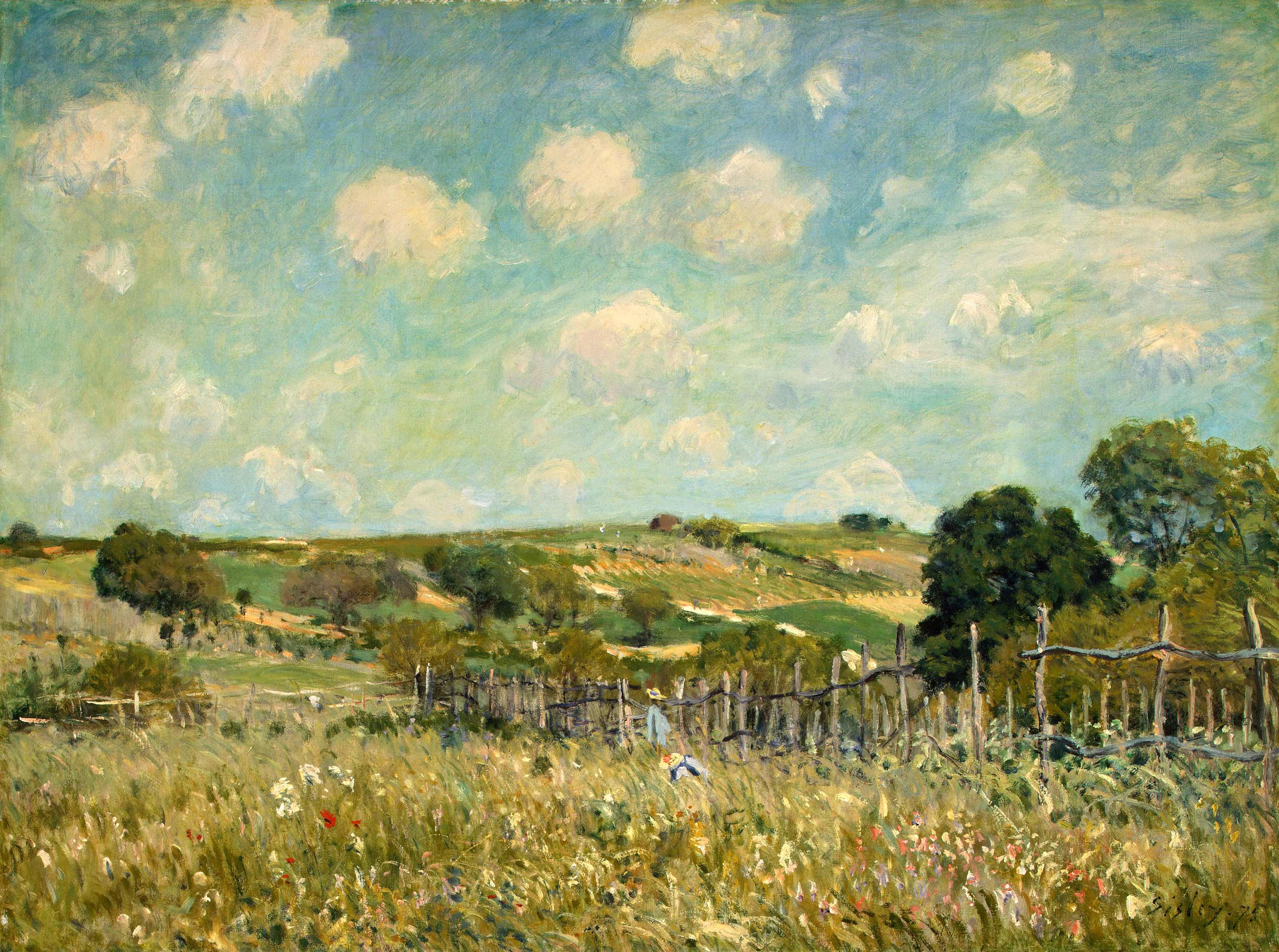
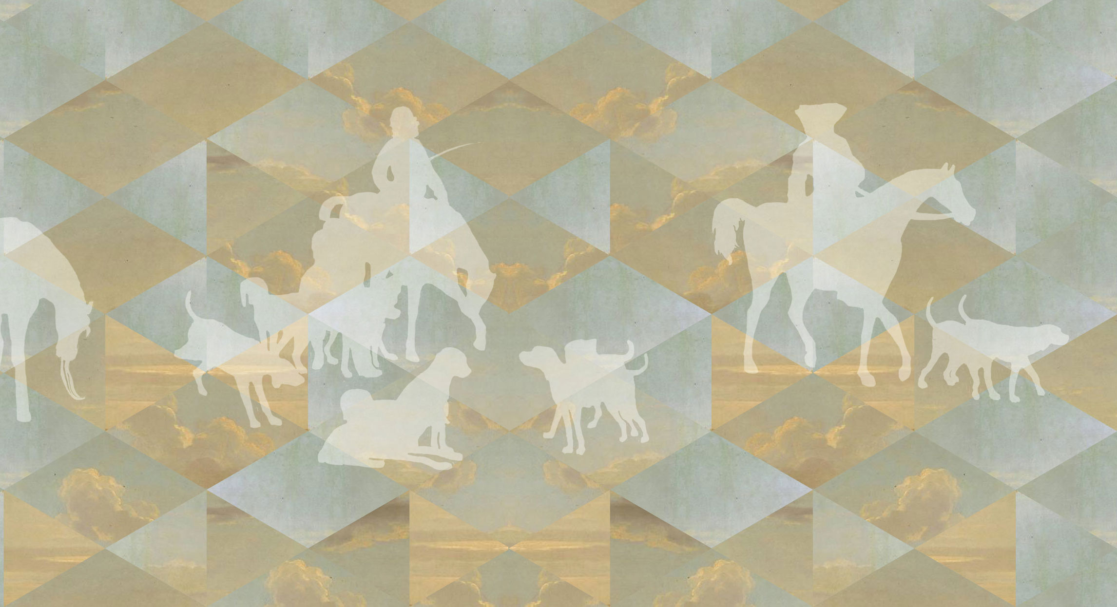
Heritage Remixed was a visual system that entailed remixing visual elements of several 18th and 19th century romantic landscape paintings of the very-sleepy english country side. The paintings used are public domain.
A challenge was to find a way for it to be ridged enough for everyday brand communication materials as well as be visually diverse enough to accommodate a rigorous schedule of the numerous upcoming marketing and product campaigns.
This was accomplished in several ways:
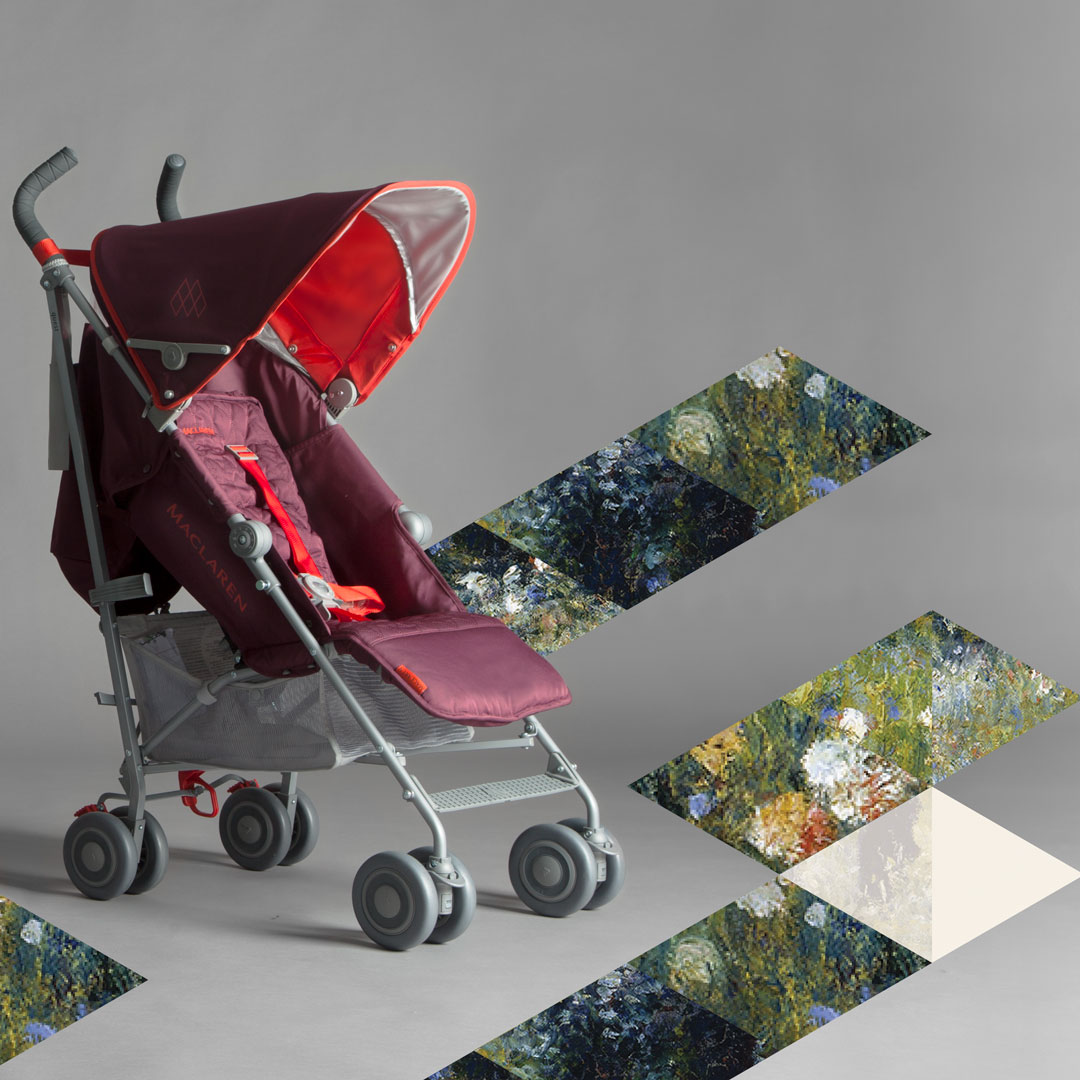
A versatile method of first chopping the painting into pieces from a specified grid, and remixing them into a visual color pattern. With the use of several paintings, results vary mood and personality.
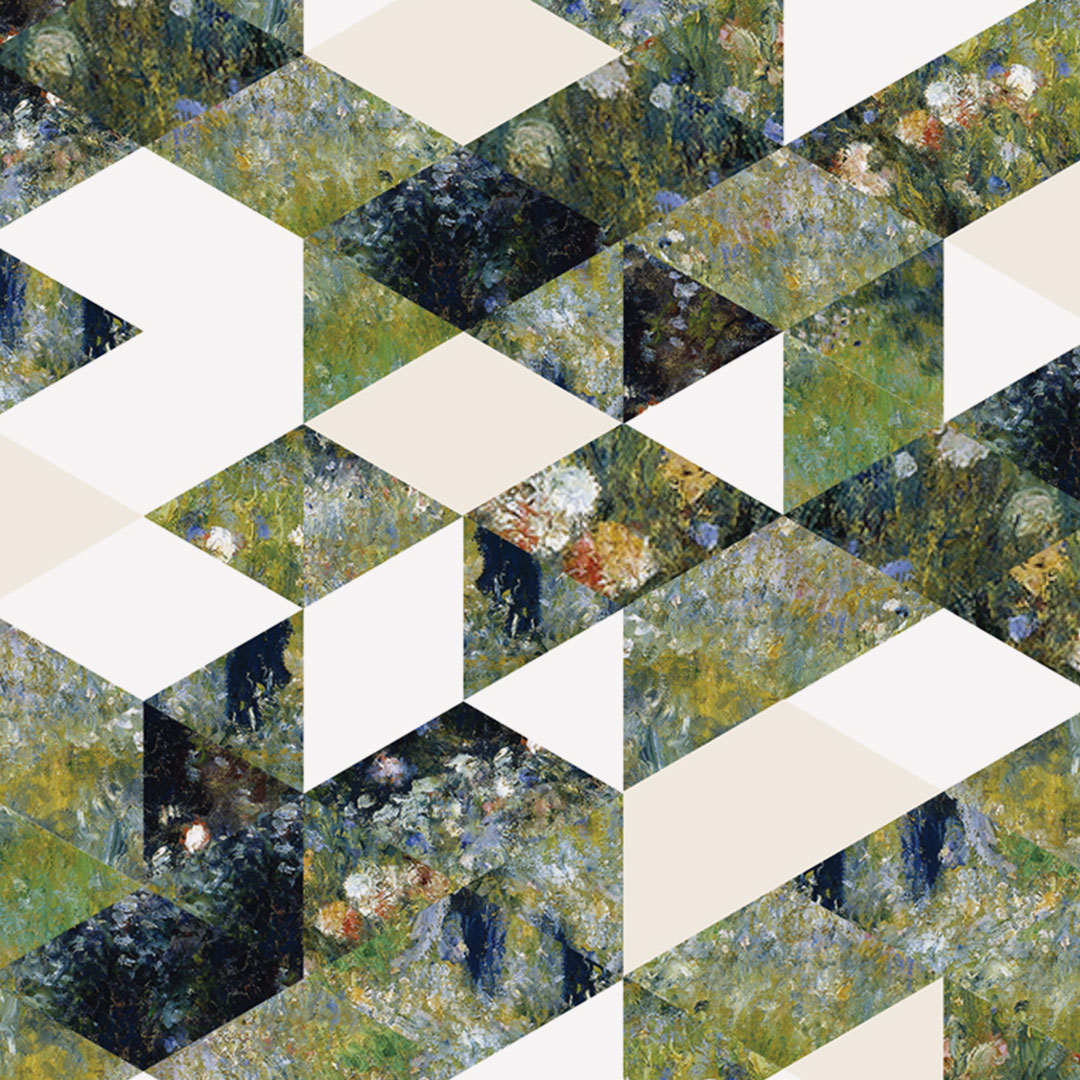
(A) Rearrange these pieces within the grid of alternating either the; (or all) art pieces cool and warm colors, brand color blocks, or white spaces to create dense rich cover art.
Detail: Taken from the 2016 mini-book cover.
(B) More sparingly arranged as trail patterns, utilizing enough white space. This method creates a "pho-depth of space" applicable for general layout purposes.
Detail: Taken from marketing asset delivered to China.
(C) Flexibility was allowed for consumer print materials and seasonal social media message purposes. Grid pieces could be used to create basic universally recognizable shapes to aid in communication.
Detail: Taken from the 2015 Maclaren Mother's Day e-mail.
This method rearranged larger recognizable spacial plains of the existing paintings to create penrose effects, reflections, illusions and general weirdness to create visual intrigue.
Details: Taken from an Maclaren 'Scarlet Collection' in-box brochure.
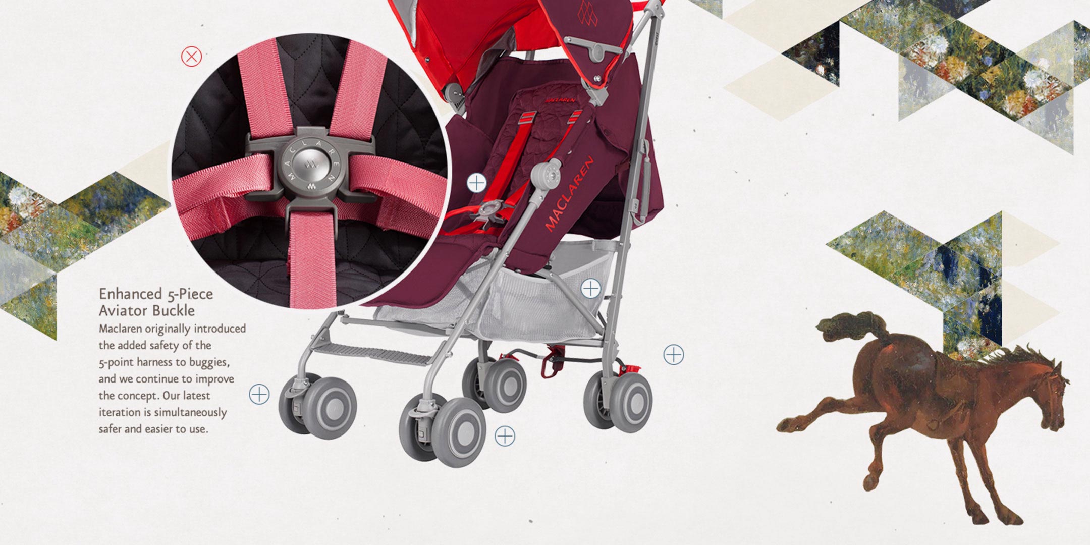
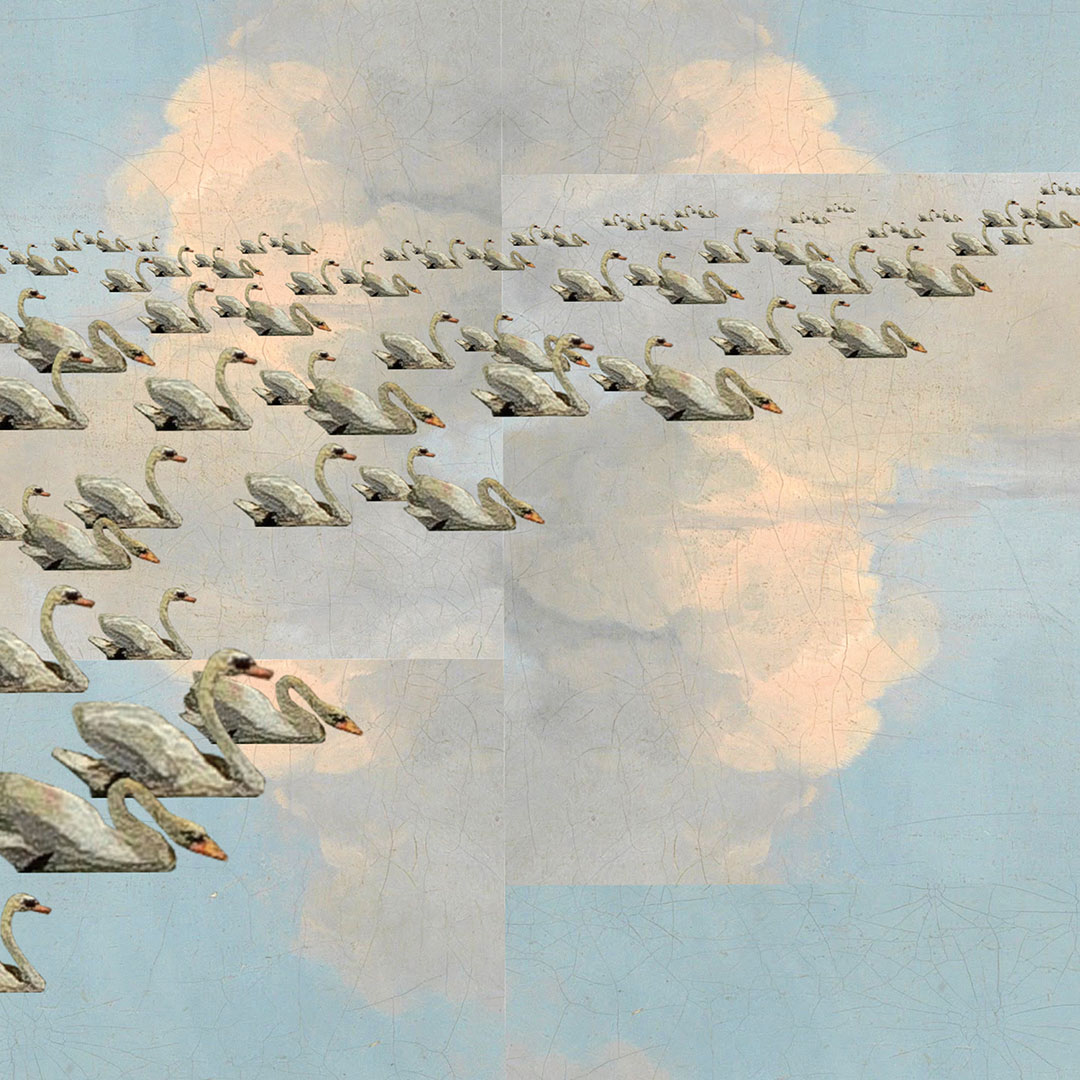
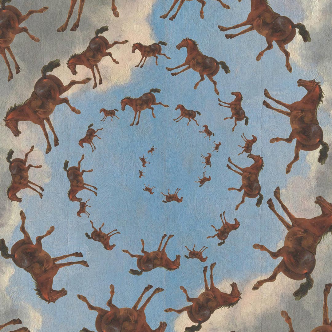
Silhouetting geese, horses, and other fun-living live stock from the paintings and utilizing them independently in a playfully and –thoughtfully– within product layouts.
Detail: Taken from World of Maclaren web feature.
Brand Message :: Year One
Heritage Remixed: Flights of Fancy
It was decided to take lifestyle photography in new direction and shoot in studio, oppose to the on-location shoots from years before.
The plan was to take our remixed abstracted landscape tiles and reconstruct them into an actual 3-dimensional landscape-set that our models can interact with.
Over the course of a week the product photo studio transformed our into a whimsical set full of colorful painting bits and props for our little models and on a few occasions, dogs.
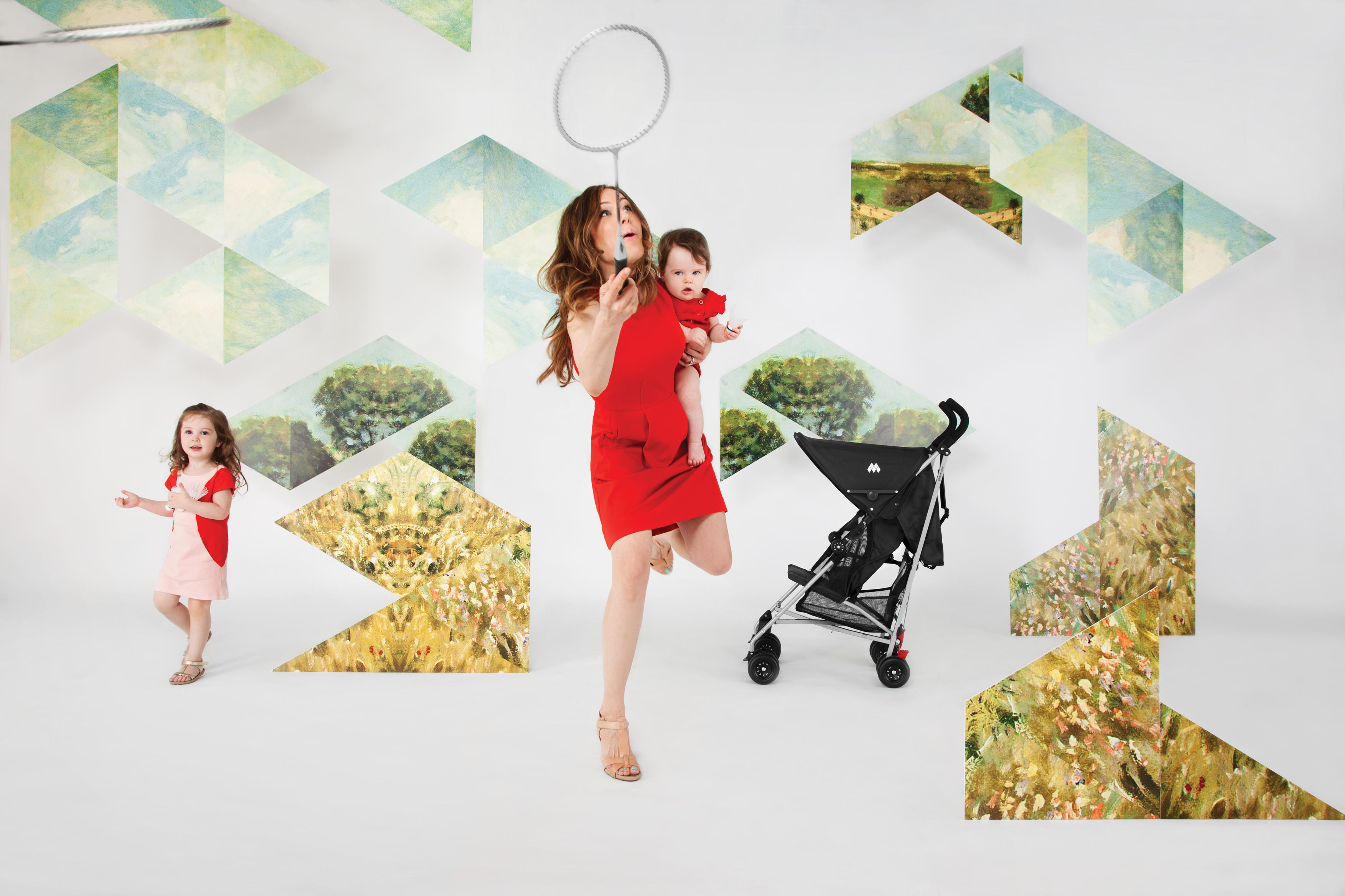
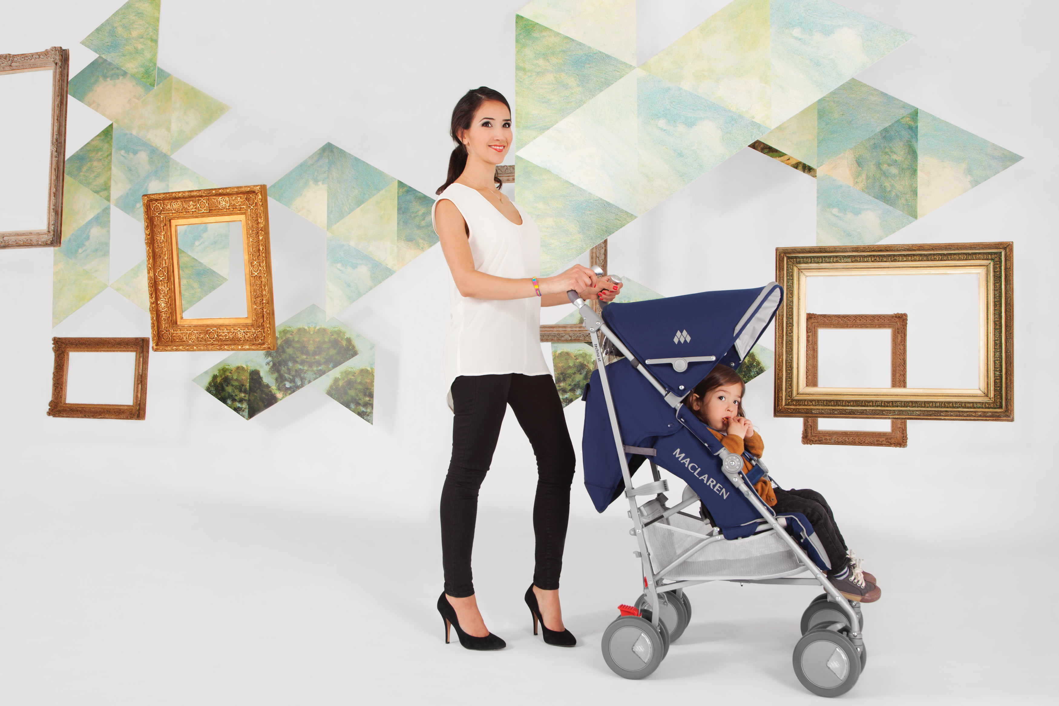
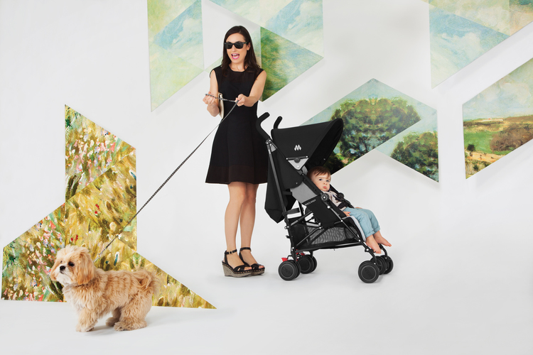
In the wild the message of Flights of Fancy became overtaken by a strong Maclaren 50th Anniversary Campaign. The end result: Flights of Fancy was imagery that supported other coexisting marketing messages, and less of a message directed at the consumer.
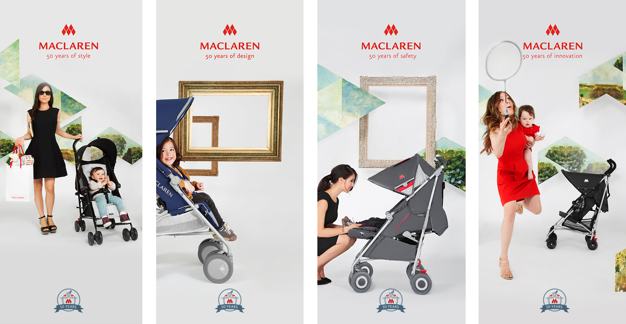
Four banners of a five piece in-store banner set for Maclaren 50th Anniversary prominently featuring Flights of Fancy lifestyle photography.
Brand Message :: Year Two
Heritage Remixed: Painting with Light
Product photography focusing on the bright colors of the newly refined Maclaren Core 3.0 line. In contrast to Flights of Fancy, the message Painting with Light came directly from the product, therefor its message was more obvious to consumers. As seen below Painting with Light stands out prominently in headlines from; print ads, to brochures, to digital.
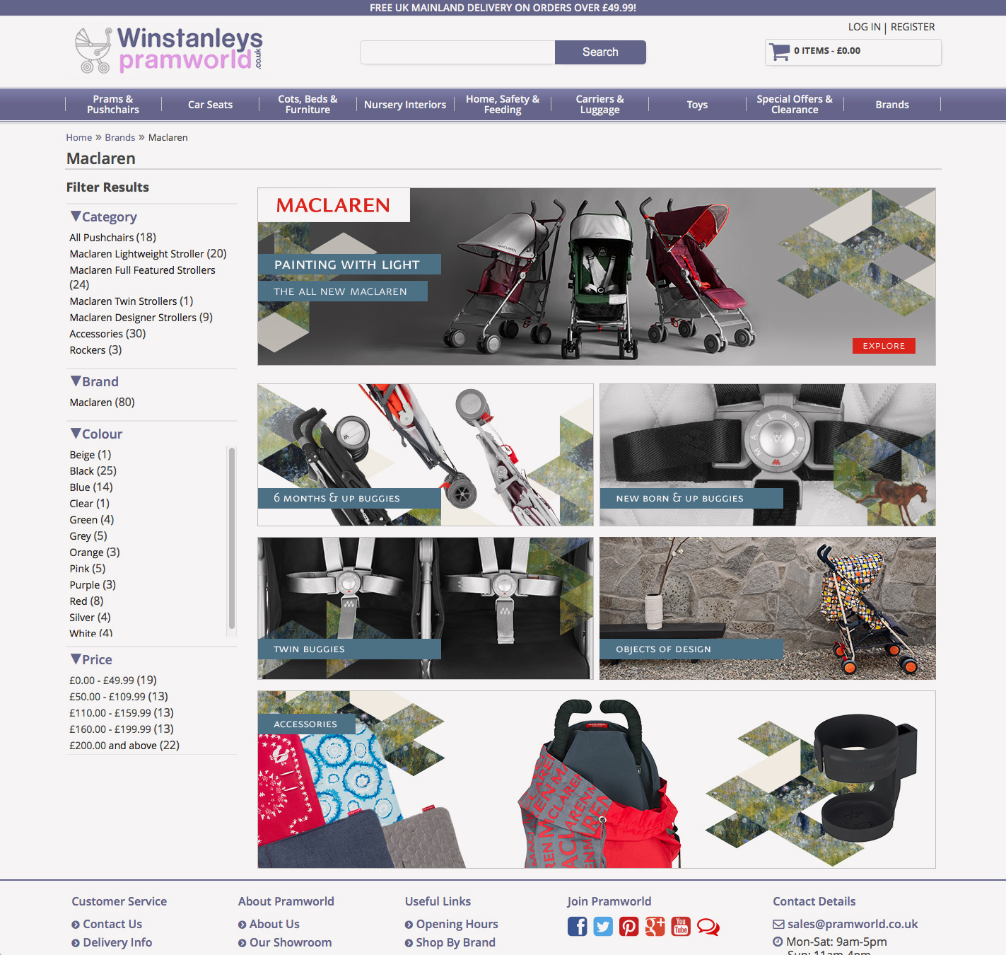
Maclaren's Brand page in Winstanleys Pramworld eCommerce site.
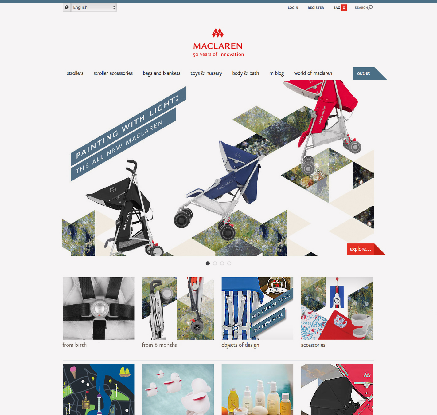
The home page of the Maclaren eCommerce site. Yes, maclaren ran its 50 Anniversary Campaign for two years.
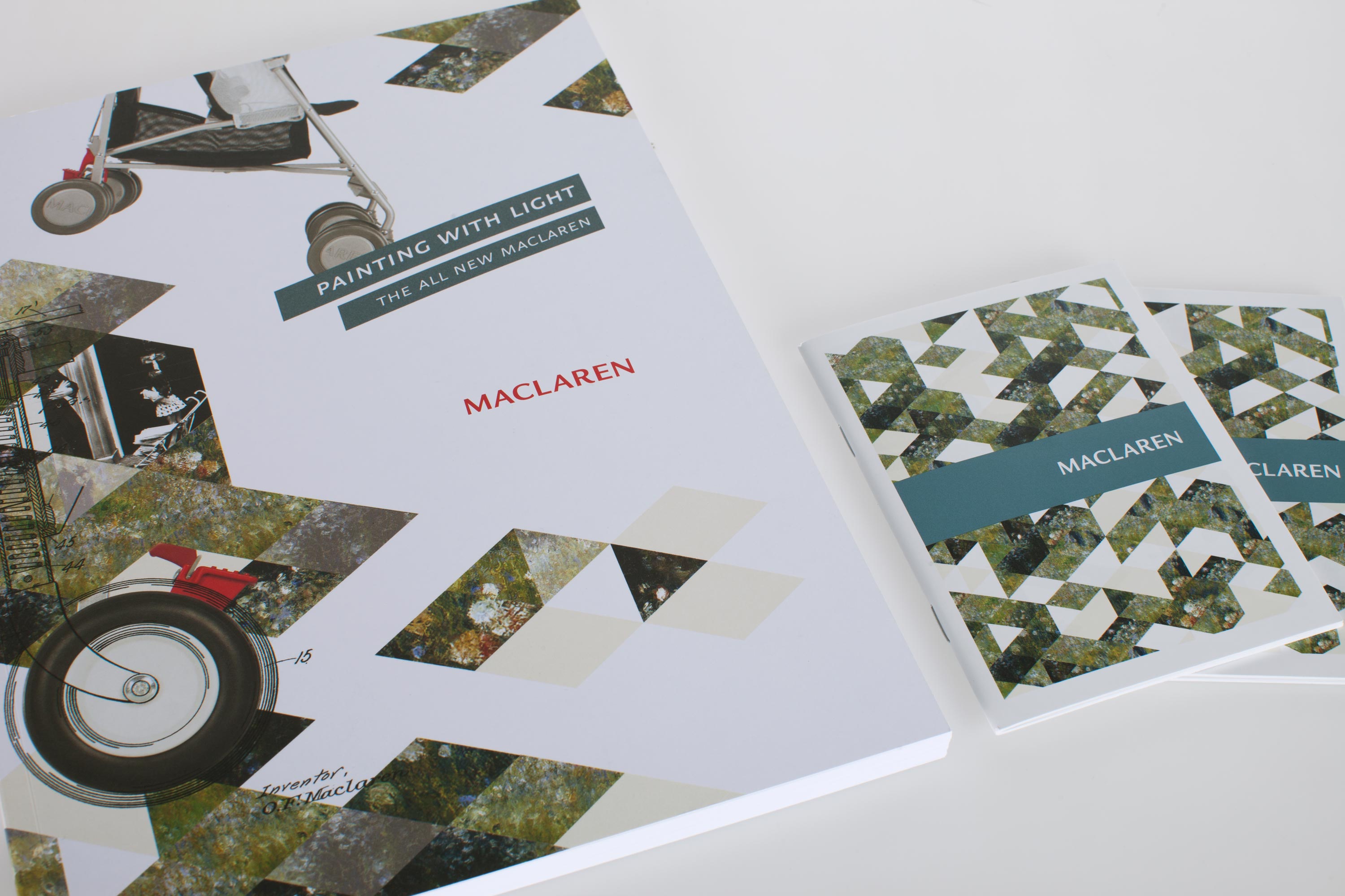
The Maclaren tradefolio and consumer mini-book.
The Results
A System That Never Got Boring
The Heritage Remixed Campaign successfully provided Maclaren a flexible, multi-purpose visual system with the ability to accommodate multiple coinciding consumer campaigns, brand messages and marketing communications.
Lent from its paintings, Heritage Remix's strong textures and interchangeable color palette, gave Heritage Remixed the ability to give each Maclaren campaign a distinct, sometimes surprising visual style, while tying its graphics together within the same visual family.

Heritage Remixed: Flights of Fancy
Heritage Remixed: Painting with light
Heritage Remixed: 50 Years of Maclaren, B-01
Taken from an updated World of Maclaren feature page. See Here!