Branding / Identity System / Print / Digital
Introduction
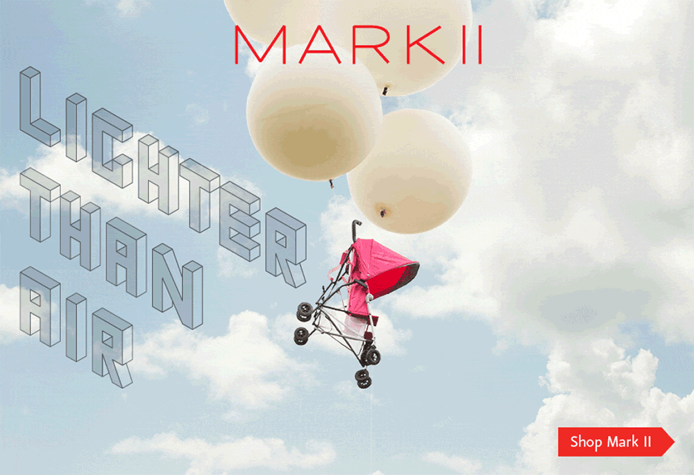
Mark II: Lighter Than Air
The term Mark refers to factory plates indicating the modification version of a product. The Maclaren Mark II name derives from it's predecessor the B-01, and represents an incremental step forward in Maclaren's manufacturing innovation.
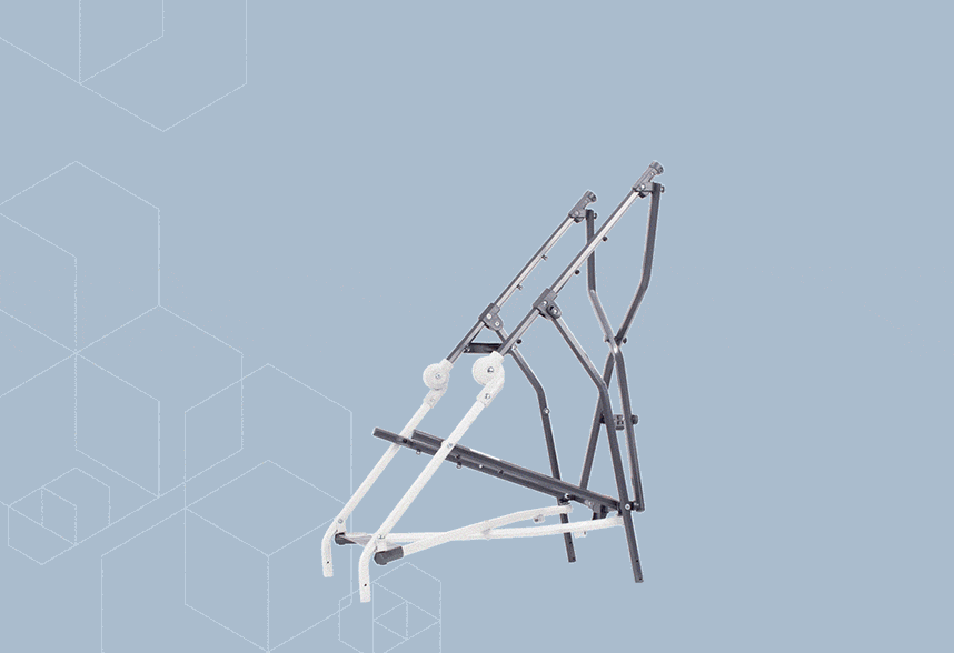
The Mark II logo was inspired by it's hexagonal tubing, which gives the product the rigidity and strength needed in the lightest form possible.

Complexity with Purpose.
The Mark II visual identity communications system (VICS) lives within the overarching Maclaren brand. This sub VICS brand purpose is to give the Mark II an independant voice that has the ability to scream in a product campaign, or whisper within the Maclaren parent brand system.
The mark II VICS comes with a range of visual elements that include;
 Two Mark II logos
 Lifestlye photography
 Color palette
 Various patterns of overlapping hexagons
 Typography / a full alphabet of custom headline lettering
Branding / Identity System
Logo and logo-bug
The original logo-bug with the simplified alternative logo.
The visually simplified alternative "MARK II" logo for usage in conjunction with the primary logo-bug "MK-II" was developed for communications.
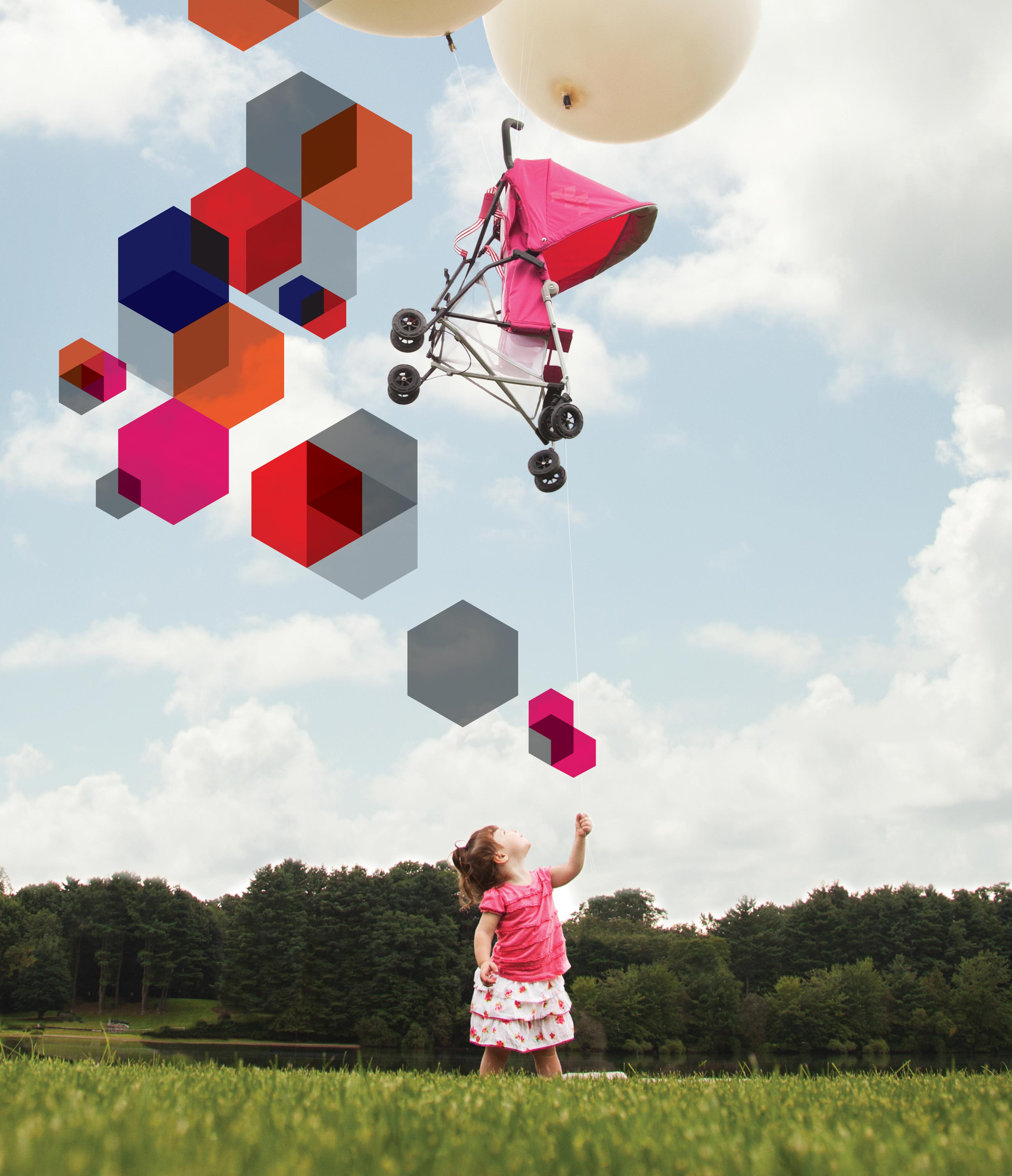
Lifestyle Photography
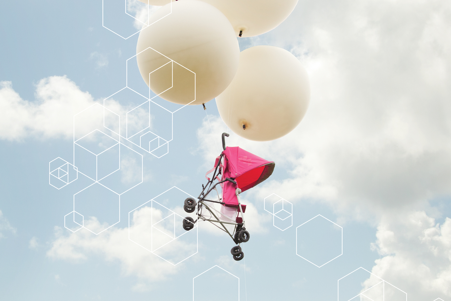
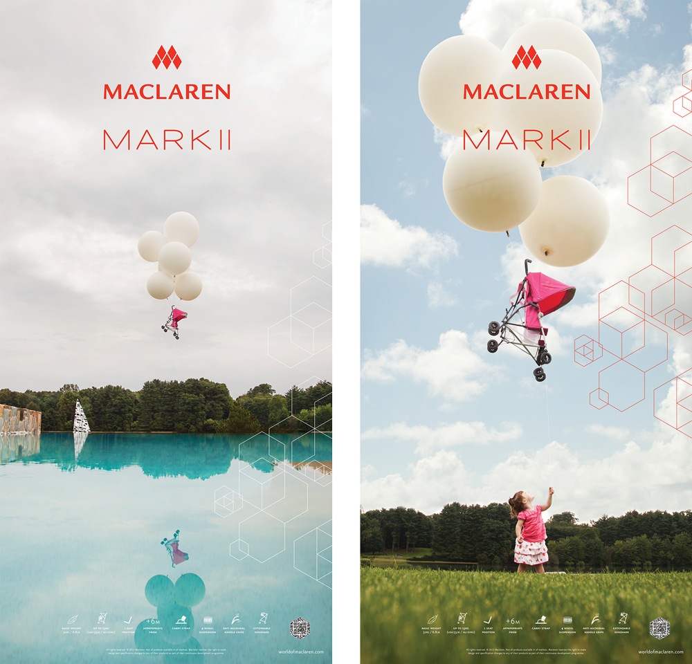
A Mark II photoshoot showcasing the lightweight stroller by floating a prototype with helium filled weather balloons over the Maclaren CEO's property in Weston, CT.
Photography by Steffen Knudsen Allen.
Usage example: In-store hanging banner set.
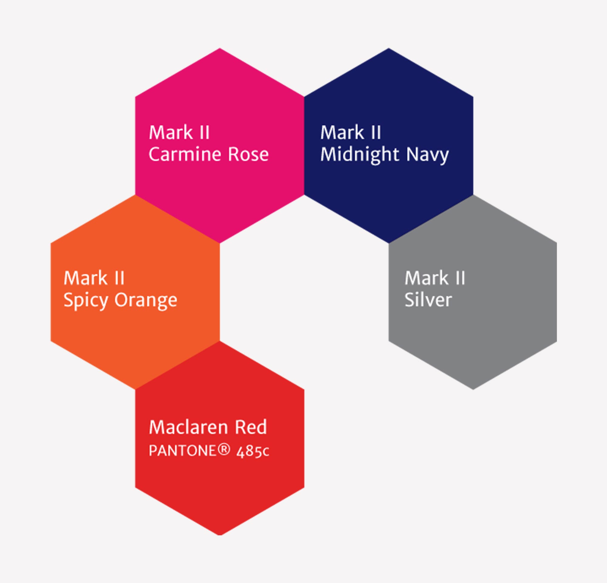
Color Palette
A Mark II color palette is comprised of the original four stroller colors along with the parent brand color Maclaren Red.

Hexagonal Patterns
The Mark II hexagonal vector designs came in spectrum of colors and designs. Above is the evergreen version, that comes in 1 and 4-color. This pattern became one of the visual keystones of tying product campaigns, in-store posters and consumer packaging together.
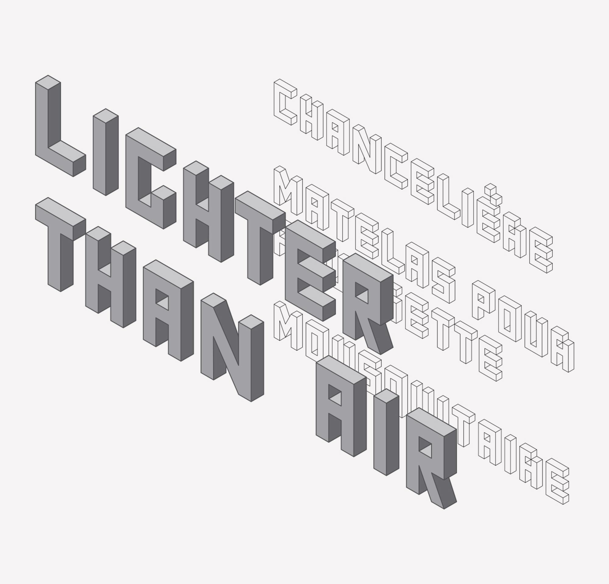
Typography
The Mark II headline vector-type was developed with baseline grid of 30° grid and designed to compliment hexagonal pattern that became heavily used in communication materials. This was used exclusively for campaign graphics and special consumer print materials. The alphabet grew in size to accommodate most latin language characters.
Application Spectrum
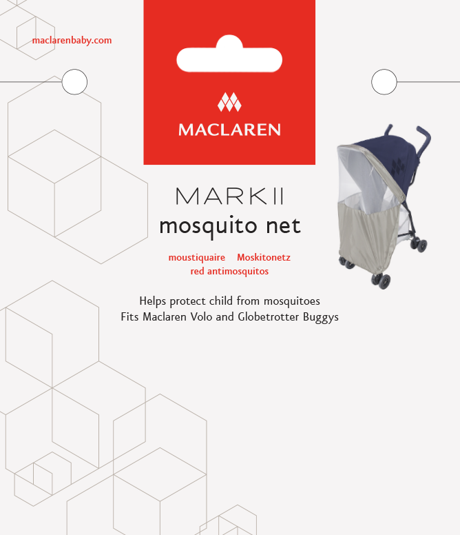
Accessories Packaging
The Mark II uses the hexagonal pattern and the simplified Mark II logo to differentiate from the stark-white, clean Maclaren core packaging on the shelf.
Consumer Brochure Detail
The intriguing lifestyle photography mixed with a bright color palette shine on the consumer brochure.
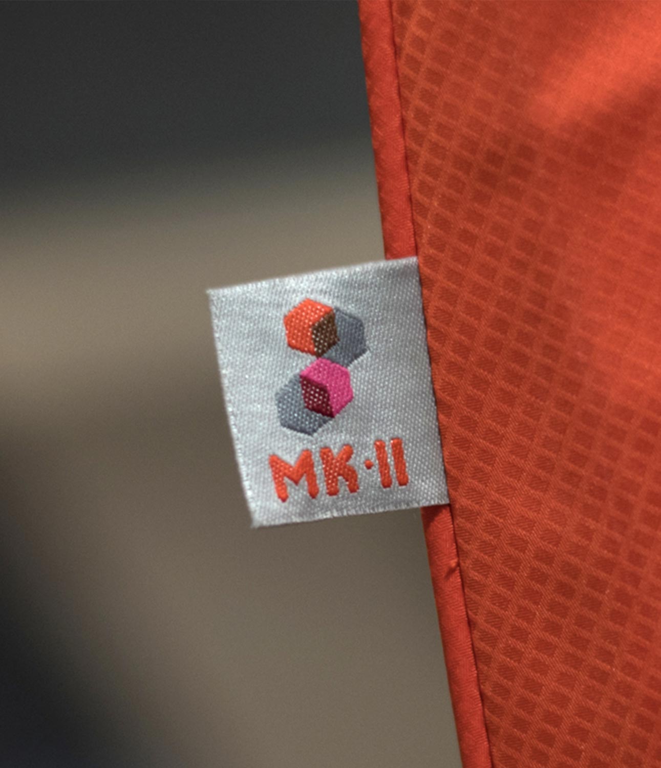
Product Branding
The logo-bug and visual system graphics shown on tag located on the retractible hood on all models.
Print Materials
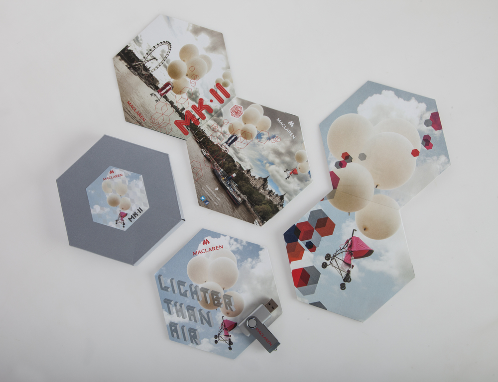
Mailable Press Packet
Custom press package envelope with print and digital promotional materials for venders. Package includes: die-cut cover sheet, accordion-folded brochure, and Maclaren branded USB with digital assets.
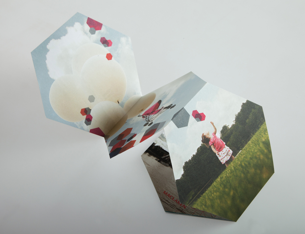
Poster Leaflet
Mult-purpose B2B/B2C accordion-folded promotional poster leaflet.
Digital
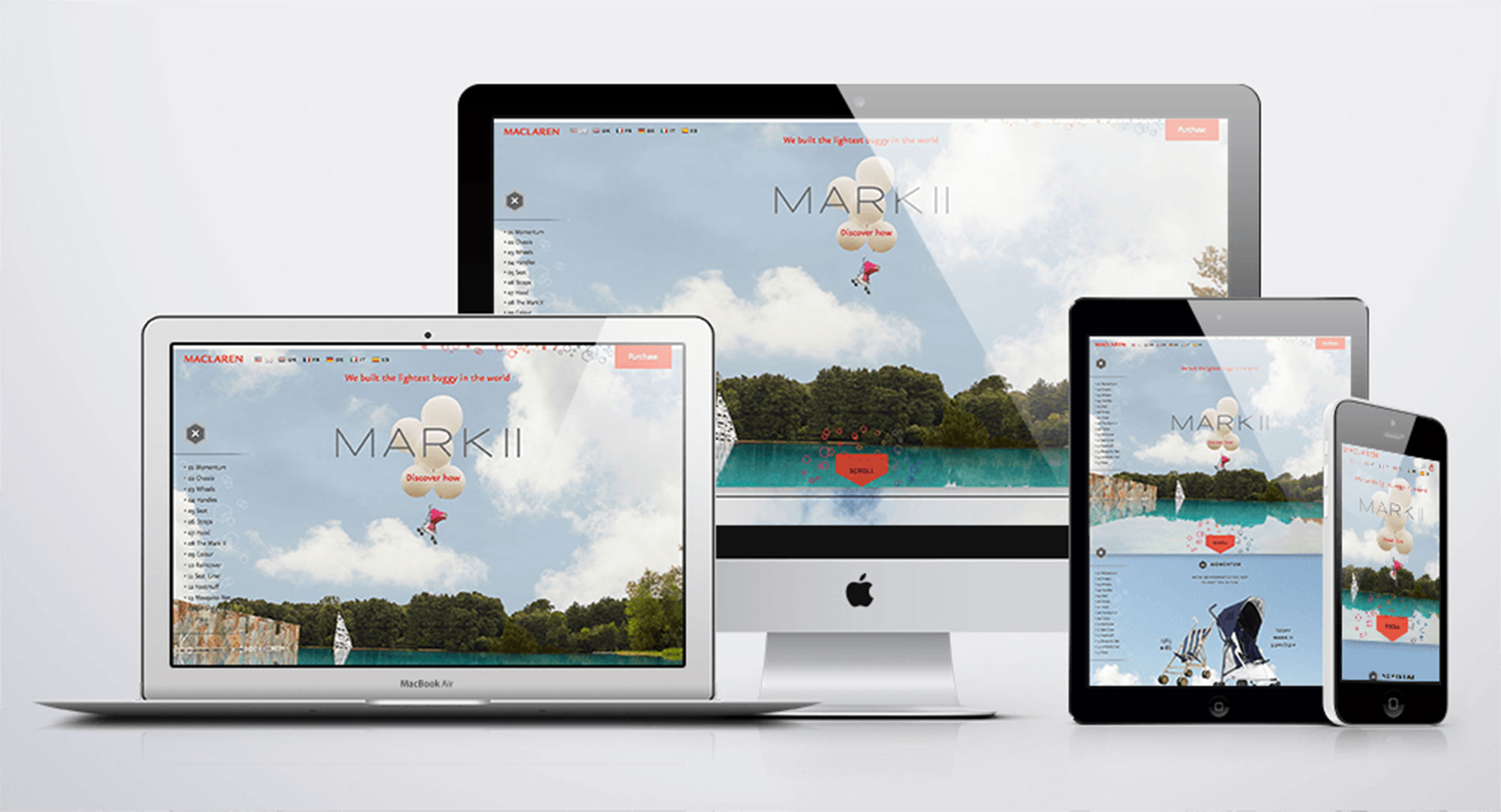
Parallax Scrolling Microsite
Art Directed the responsive parallax scrolling microsite featured on World of Macalren.
E-Commmerce Animated Web Banner
Animated gif banner feature for the Maclaren e-Commerce site.
2018 World of Maclaren Feature Update
Updated World of Maclaren feature page. Notice the absence of the simplified logo. See Here!